The Home Depot Mobile App
A case study conducted during my time in the General Assembly UXDI course.
The Home Depot: Browsing for DIYers
Integrate a new set of features into the existing Home Depot App that lets DIYers plan projects and find out if project materials are available for purchase.
Project Result
I worked with 3 General Assembly classmates to create a digital browsing experience that brings in-store expertise into your home and generates “quick start” shopping lists based on pre-existing DIY tutorials that Home Depot publishes on its blog and Youtube page.
Project Roles
- Competitive Analysis (shared role)
- User interviews (shared role)
- Synthesis of research (shared role)
- Design Studio Facilitation
- Prototyping
Project Features

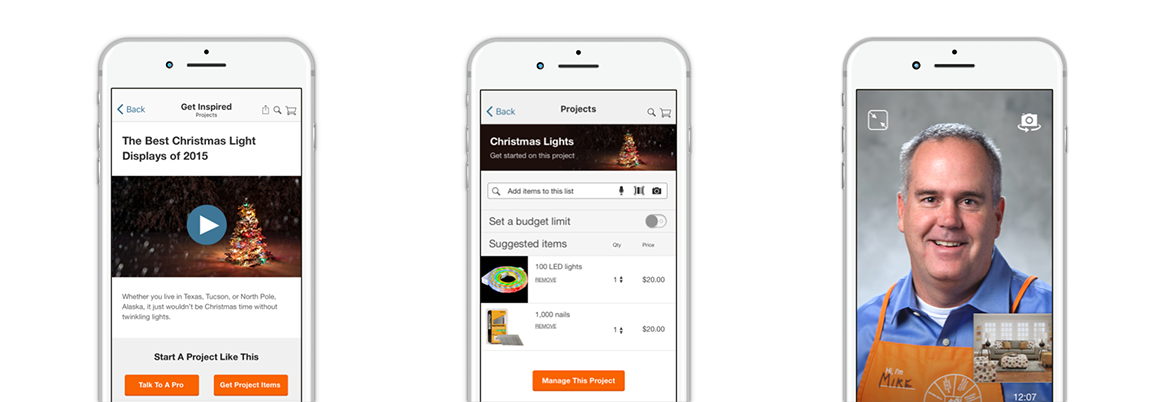
Browse Tutorials
Get project inspiration by browsing through existing Home Depot tutorials and project examples.
Create a Project List
Quickly add and manage necessary project materials with “quick start” shopping lists that are included with each tutorial.
Talk To A Pro
Speak with an expert from the comfort of your own home, and show them exactly what you’re working on.
Project Process
1. Competitive Research
How do hardware store apps create value for customers?
- Lowes
- Ace Hardware
- Home Depot
2. User Interviews
Learn how DIYers get inspiration, manage projects, and shop at hardware stores. Distill insights into user personas who will guide decision making and solutions.
3. Design Sketching
Sketch and refine feature ideas using roughly 20-minute design studio sessions.
- 5 mins sketching
- 9 mins critiquing (3 mins per person)
- 5 mins synthesizing critique
4. Refine Design Fidelity
How do hardware store apps create value for customers?
5. Prototype
Initial testing is done with low fidelity paper sketches, then with medium and high fidelity digital wireframes.
6. Iterate on Feedback
Feedback from prototype testing is incorporated into each successive round of design revision and testing.
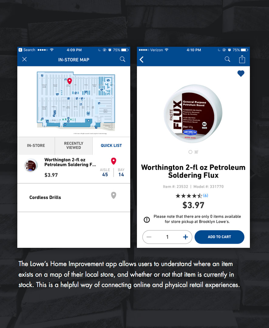

Competitive Analysis
Key Takeaway
Hardware store apps can create value for customers by helping them bridge digital and in-store shopping experiences.
User Interviews
Key Takeaway
- People generally don’t share their projects on social media but do like to learn new DIY skills online
- Suburban homeowners like shopping in-store for project inspiration and ideas, to actually see the products (even if they end up purchasing online), and to talk to someone for advice.
- Urban apartment dwellers are also prone to shopping in store but it’s usually for immediate need fixes and repairs



Personas
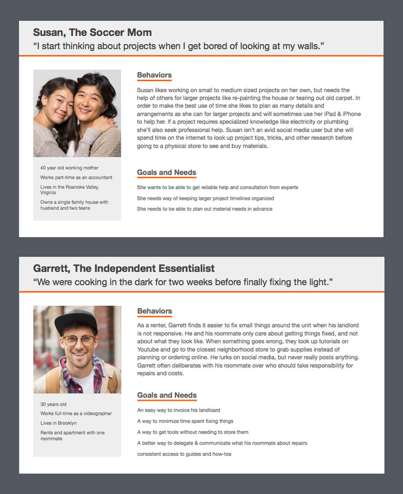
Research was synthesized into two personas:
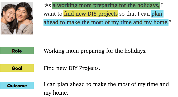
Susan, A 40 year old suburban homeowner and mother.
Garrett, a 30 year old urbanite who rents an apartment with one roommate.
Susan was selected as the primary persona because she is more prone to planning projects. She also has existing behaviors of looking for project inspiration and shopping between online and physical hardware stores.
Design Sketches
Three feature concepts were produced during design studio sketching sessions.

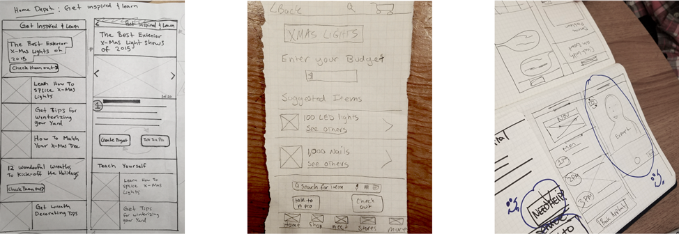
Finding inspiration through project tutorials.
Managing and budgeting for projects with curated shopping lists.
Speak to an expert at home with video chat.
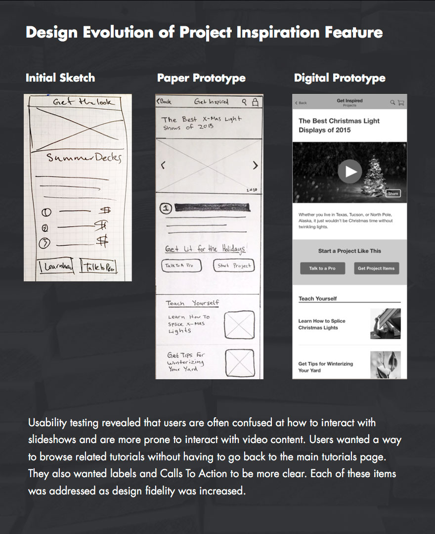

Prototyping and User Testing
Each team member took ownership of prototyping and refining a single feature concept at the low fidelity stage.
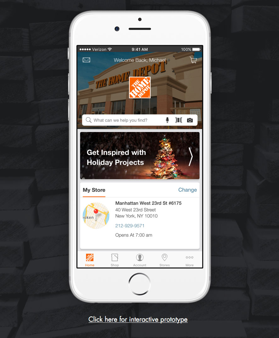
I worked specifically on finding inspiration through project tutorials, then I took ownership of unifying and further refining all feature screens to make a medium fidelity prototype.
Next Steps
Provide a way for shoppers to create their own lists
Currently, users can only create project lists that are attached to an existing project on the inspiration page.
It could be beneficial to give customers a way to create and manage project lists on their own, without any Home Depot curation.
Further testing on lists
Get more detailed insights into how people interact with project lists and refine interactions.
Provide access to Project Lists and Talk To A Pro feature from home screen.
They currently exist with all other features inside the app’s massive overflow menu. There’s probably a more contextual way to organize this!
See The Full Case Study
Download the full case study to learn more about the details of this project and others that I worked on during my General Assembly User Experience Design Immersive course.

